COOKIES
We use cookies to make your experience better. Read more
Color is an irreplaceable form of communication—immediate and strong. It’s especially important in today’s fast-paced world, where first impressions matter so much.
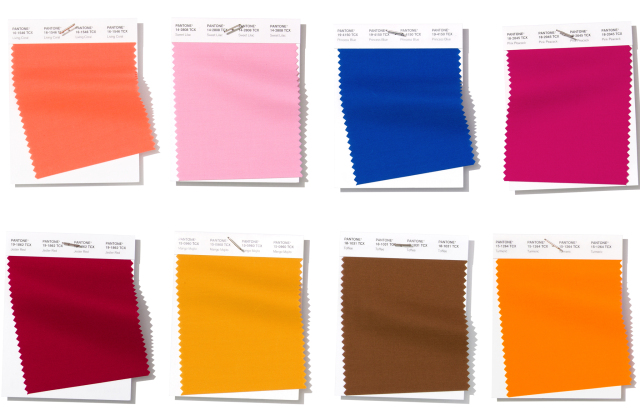
Be assured: there’s a little something for everyone—from clean, subdued whites to bright and vibrant tones. With that in mind, let’s take a look at these diverse color trends coming in hot in 2019.
DASHING RED
Being such a powerful color, a little bit of red in your design can go a long way. So imagine what you can achieve with a lot of it!
Red was seen as the color of blood and fire by our ancestors, further being associated with love, passion, energy and strength, but most commonly, with joy and wellbeing.
BASIC WHITE
If you need a break from the sheer magnitude of all this red, you may find serenity in the cleanliness of the white neutrals trend. White is the symbol of purity and is often associated with honesty and neutrality. Thanks to these characteristics, the use of white in design has an immediately calming effect. It makes any composition soft and airy and gives it a sense of wonder.
White has been around forever, but it looks like it is taking center stage in 2019. It’s perfect for brands that are modern and elegant, given that whitespace is the primary ingredient in a sleek, minimalistic look. Obviously, it will always be combined with other colors (usually other neutrals), but as long as those colors don’t take over the composition and overall look, you can still take advantage of this trend.

SWEET LILAC
This baby pink has just a touch of lavender, making it one of the cool color options in the spring 2019 color trends. It is a gentle color that is feminine but not sickly sweet. Designers this season used it in both sleek, minimalist designs and in some girlish creations.
LIGHT LAVENDER
Lavender is yet another pastel that made an appearance in the spring/ summer 2019 color trends. It is a cool shade that works well with softer yellows, as well as with a deep neutral like Eclipse or Brown Granite.
LIVING CORAL
This bright coral sits perfectly between orange and pink, and brightens up every ensemble. Of all of the spring/ summer 2019 color trends, this one might be the most seasonally appropriate. It is a color that brings to mind fruity drinks, pretty flowers, and tropical vacations.
HOT TURMERIC
The eponymous spice is having a moment right now, since it is known for having serious health benefits. If you’re not planning to be chugging turmeric lattes or doing turmeric-yogurt face masks, perhaps you can absorb some of these benefits by wearing Turmeric as one of the spring/ summer 2019 color trends. It is a yellow-orange shade that is hard to miss, and pairs especially well with browns, reds, and even blues.
NEON GREEN
In a season of soft naturals and pastels, neon green shouts and screams demanding to be heard. All kinds of neons showed up as part of the spring/ summer 2019 color trends, particularly on runways inspired by an Eighties punk sensibility. Outrageous, difficult, and in your face, neon green is definitely the loudest of the spring 2019 runway colors.